Over the years there have been a number of investment theories based on the Dogs of the Dow or some variation of it. Some of these theories suggest that you should buy the 10 worst performing stocks in the Dow Jones Industrial Average from the previous year and hold them until the end of the year.
Another suggests buying stocks in the Dow with the highest dividend yield. Regardless of which theory is the original, something caught my attention with the sector performance so far this year.
Standard & Poor's groups stocks into 10 major sectors- basic materials, consumer discretionary, consumer staples, energy, financials, health care, industrials, technology, telecom and utilities. Each sector has an ETF that tracks its performance. What caught my attention was the behavior of these ETFs and how the Dogs of the Dow Theory may be working with the sector ETFs over the last 18 months.
In the last year-and-a-half, the market has gone through three distinct periods. From October 2010 thru April 2011, the market experienced a bullish period. From April 2011 thru September 2011, the market experienced a bearish period. And from October 2011 up through today, the market has enjoyed another bullish period.
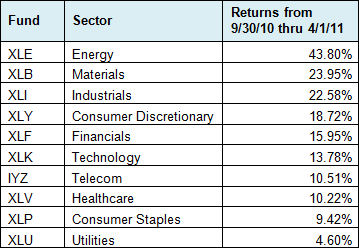
Watching these three periods, I could not help but notice how the different sectors performed. During the first bullish period, the performances ranged quite dramatically. The table below shows the ETF for each sector and their performance during this six-month period. Energy led the way while utilities was the laggard.

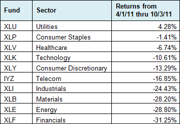
During the next phase – the bearish period from April 2011 thru September 2011 – the tables turned dramatically. The top sector from the previous period (energy) became the second-worst performer, while the worst performer (utilities) became the top dog. In fact, utilities was the only sector in the black during this market phase.

This brings us to our third market phase, the bullish phase we are currently in. Since the market bottomed at the beginning of October, stocks have been on a tear. As a result, the top five performers look similar to the first bullish period. In fact, the five funds are the same, though in a slightly different order. We also see utilities at the bottom once again.

Three things jump out at me from these three tables. First, the consumer discretionary sector was in the top five performers during all three periods. Second, the telecom sector was in the bottom five during all three periods. Lastly, the only ETF that experienced a positive return during all three periods was utilities (XLU). XLU just happens to be the most recent addition to my ETF Master Portfolio.
Are these tables simply indicative of sector rotation? For those not familiar with sector rotation, it's an investment theory based on economic cycles. During boom periods, sectors such as energy, materials and industrials tend to outperform. During recessionary periods, utilities, healthcare and consumer staples tend to do better.
But I can't really attribute the performance results to economic cycle. Over the last year- and-a- half, the economic picture hasn't really changed that much. GDP has been pretty consistent with a growth rate between 0.4% and 3.0% and the worst growth rate was in the first quarter of 2011 when the market was in a bullish phase.
Rather than pinning the cause on economic cycles, I think investment cycles are more culpable. The ETFs that performed the strongest in the first bullish period were the most overbought and the most vulnerable to a sharp pullback. These same ETFs were the most oversold after the bearish period in the second and third quarters of 2011. So now they have rallied the most over the last five months.
This leads me to today. The same ETFs that were the most oversold in October are now the most overbought after the rally. The market is overbought and sentiment has become more optimistic. These factors lead me to believe we are about to experience another pullback, which has me believing that XLU will be one of the top performers again over the next six months.
 Facebook
 Twitter