The frog is simmering away. Oil and gasoline prices have risen just slowly enough to where most consumers haven’t quite felt the pinch.
Moreover, our brave leadership at the Federal Reserve notes that inflation is low – forgetting of course that oil prices are still well above even inflation-adjusted averages over the past 20 years.
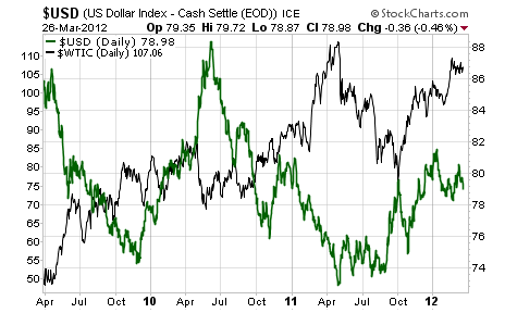
We can certainly blame the Fed for higher oil prices – after all, the dollar seems to crash just as the price of oil rises:

And while I think you should keep an eye on the dollar, this chart isn’t the one I’m interested in right now.
That’s because I’m looking at the other end of the equation. Dollar denominated oil is interesting, but how about oil supply? The Fed can press a button and change the supply of dollars, but no matter how many buttons it pushes or levers it pulls, the supply of oil is far out of the Fed’s reach.
And while we all feel super-rich for having a higher stock market brought on by the Fed’s policies, we won’t be feeling very rich when the supply dynamics of Peak Oil continue to be felt.
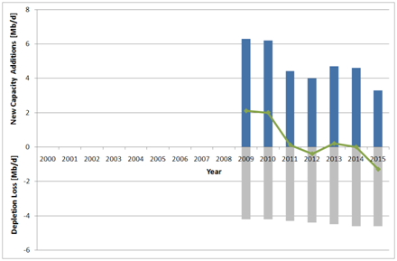
Take a look at the following chart (care of the Oil Drum):

This chart shows that the world’s capacity to produce more oil will very soon be constrained.
What happens to prices when supply drops? We all know the answer.
What happens to the Fed’s plans when their policies force weak dollars to chase even scarcer oil?
I can’t say – but my prediction is that we’ll see another recession – or a depression. A spike in dollar denominated oil prices, whether caused or exacerbated by Fed policy or not, is generally a recipe for a market slow-down.
American oil production aside, our increased numbers aren’t slated to out-pace the general drop off of world oil production. That’s good for American oil companies, not so great for American stocks.
Invest accordingly,
Kevin McElroy
Editor
Resource Prospector Pro
 Facebook
 Twitter