Technicians, chartists and technical analysts use charts to analyze a wide array of securities and forecast future price movements. Perhaps the most popular charting method is the bar chart. However, each person must carefully decide which method of charting he or she is going to use.
The bar chart offers a wealth of information, if you know how to apply it. In a bar chart, each bar represents the high, low and close for a particular day. The branches on either side of the bar represent the open and closing price.
The bar chart differs from the line chart, which only graphs closing price. Below is an image of Apple (NASDAQ: AAPL) using both the line and bar styles.

The bar chart allows traders to more easily notice intraday movements, which is why professionals use them. The intraday data affords professional and seasoned traders with a better view of support levels.
To see what I mean, look at the two charts above a second time and try to locate AAPL’s support level. With the line chart, it appears as though Apple shot straight higher from January. While that’s mostly accurate, the bar chart reveals temporary dips that starts in late February.
The line chart does not reveal any dips. By only using the line chart, it would have been impossible to spot February support levels. Those dips are essential to short-term investors and a savvy trader may have bought AAPL stock around $525 in early March to catch the ride to $643.
Long term investors can benefit from them too. Those looking to buy and hold Apple stock should be looking to add to their positions at or near $525 and be ready to buy more when the stock moves down to that level.
The March swing was tough to trade, but any trader or investor should have noted that $525 was a support zone in February if they examined the bar chart. Accordingly, they would have been ready in May to buy the dip to $525 and would be sitting with a 10% gain today. Bar charts enable more frequent and better trade setups.
However, bar charts tend to clutter quickly because of spacing. The thin lines can be tough to analyze when they are close together. It’s for this reason that many traders follow candlestick charts.
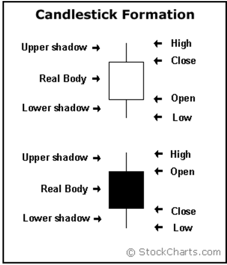
A candlestick chart summarizes the same daily information as a bar chart, but with a larger rectangle and easier display. A black or other-colored rectangle appears when the day’s price moves down; a white or clear rectangle means prices moved higher. The top edge of the rectangle is the closing price (on a clear box) or opening price (on a black box); the reverse is true for the bottom edge of the rectangle. The extent of the extensions above and below the rectangle represents the range of trading for that period.

How to read a candlestick
It is up to the trader to choose the chart style that fits them best. My recommendation, which is what I use personally, would be to give the candles a test drive because they are easy to read and provide a wealth of information per candle.
Candlesticks are far superior to a line graph. A line chart only shows closing prices over time. The candlestick chart has more data and you can use that additional information to make a more informed investment.
The bar and candlestick charts reveal the same data. It’s really up to the individual which one they choose. The candlestick is typically preferred over the bar due to aesthetics. Sometimes a chart that’s more pleasing on the eyes will be easier for a person to analyze.
 Facebook
 Twitter